Returns
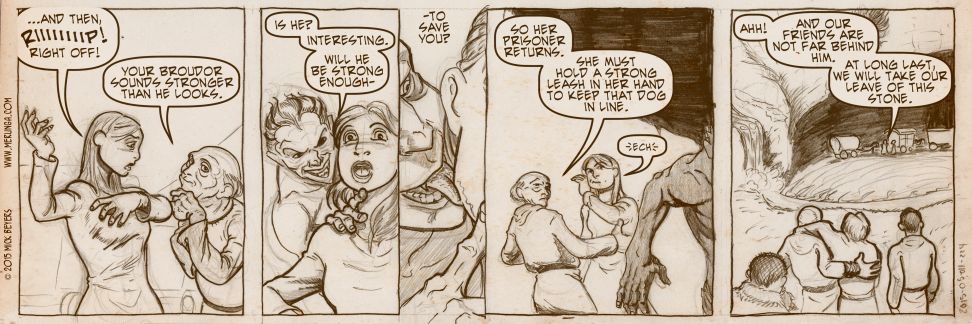
While I may have dropped the ball on this strip in terms of that last panel, the composition I’m proud of. It’s almost like a rising and falling wave across the tops of the figures. It happened mostly by accident, but I like to think that there was an intuition to the staging. I’m not trying to say I’m great at this yet, but I feel like I’ve got a decent handle on some of the fundamentals.
One day left! And then we say goodbye to the Stone.


 Offline.


I like the navigation change and I meant to compliment you on the header earlier as well. I prefer the subtle changes to one big, jarring overhaul.
When I uploaded the changes yesterday it was 30 minutes of jarring overhaul after jarring overhaul as stuff I thought was working, was not working. But now it is mostly working again.
Yes, compliments from me too. It all looks much better that way. The font in the navigation bar integrates pretty well with MM’s style yet it looks like it’s a pro-designed one (no offence). Nice pick if you re-used an existing one (and VERY nice work if you designed it!).
I stared about three or four other webcomic designs for about a month before I figured out how I wanted to do it. So, while it is ‘inspired,’ I do feel like I can claim design credit for myself, thank you.